
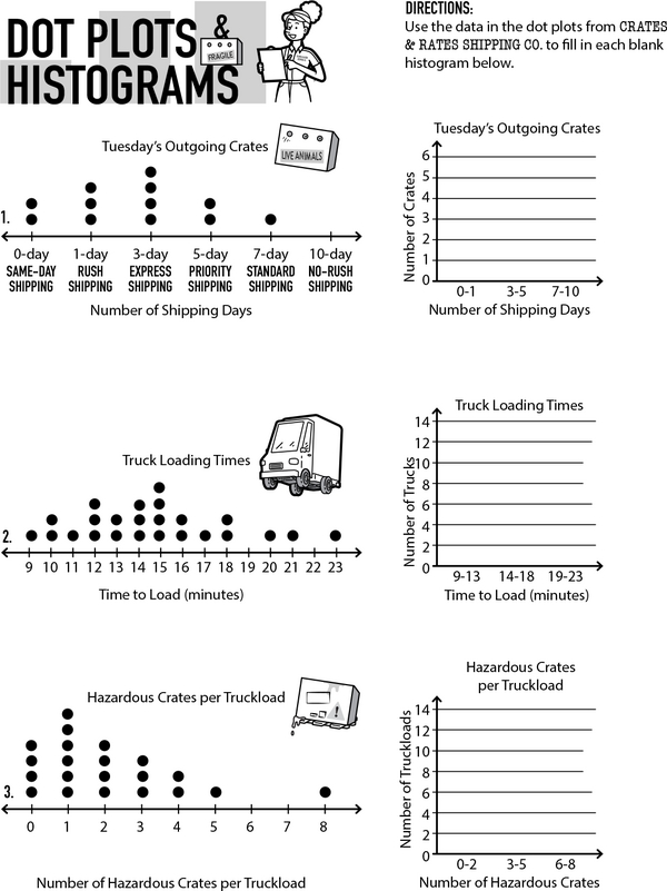
Welcome on board! Look at each dot plot. Can you use a histogram to show the data instead? Hurry, the report is due any minute!
Dot plots and histograms are useful tools for visualizing data. In a dot plot, each dot represents one data point. You can count the stacked dots to see how often something happens. A histogram doesn't use dots. It uses bars instead. Each bar represents a range of numbers, called a bin, and its height shows the frequency of that range. While the two are similar, you can condense a dot plot into a histogram by combining numbers into bins. Now that you know the difference, grab your pencil and complete the challenge.
Chart Champions: Dot Plots to Histograms
Additional Educational Resources:
Data Large Workbook - (Grade 6)
Statistics Large Workbook - (Grade 6)
Number Sense: Mastering Opposites and Absolute Values
Mastering Subtraction with Unlike Denominators - By Making Equivalent Fractions
Diving Deep into Mean, Median, and Mode
Mapping Pepper's Snack Hunt: Learn Coordinates on a Grid
Chart Champions: Dot Plots to Histograms
GRADES:

Additional Educational Resources:
Data Large Workbook - (Grade 6)
Statistics Large Workbook - (Grade 6)
Number Sense: Mastering Opposites and Absolute Values
Mastering Subtraction with Unlike Denominators - By Making Equivalent Fractions
Diving Deep into Mean, Median, and Mode
Mapping Pepper's Snack Hunt: Learn Coordinates on a Grid