
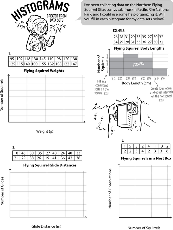
This record log on the Northern Flying Squirrel has a lot of observations. Can you organize each data set and display it using a histogram so the results are easy to understand? Thanks a bunch!
Histograms turn data points into bar charts. They are helpful for spotting patterns. Each bar represents a range of numbers, called a bin, and its height shows the frequency of that range. Study the example closely, then help the park ranger transform her data sets into histograms.
Data Sleuths: Histograms to the Rescue
Additional Educational Resources:
Data Large Workbook - (Grade 6)
Statistics Large Workbook - (Grade 6)
Scientific Notation Maze - Journey to Zero Village: From Standard Numbers to Scientific Notation
Unraveling Sequence Patterns: Follow the Rule
Estimate Like a Pro: Quick Division with Rounding
Coordinate Quest: Finding Ordered Pairs
Data Sleuths: Histograms to the Rescue
GRADES:
Additional Educational Resources:
Data Large Workbook - (Grade 6)
Statistics Large Workbook - (Grade 6)
Scientific Notation Maze - Journey to Zero Village: From Standard Numbers to Scientific Notation
Unraveling Sequence Patterns: Follow the Rule
Estimate Like a Pro: Quick Division with Rounding
Coordinate Quest: Finding Ordered Pairs