
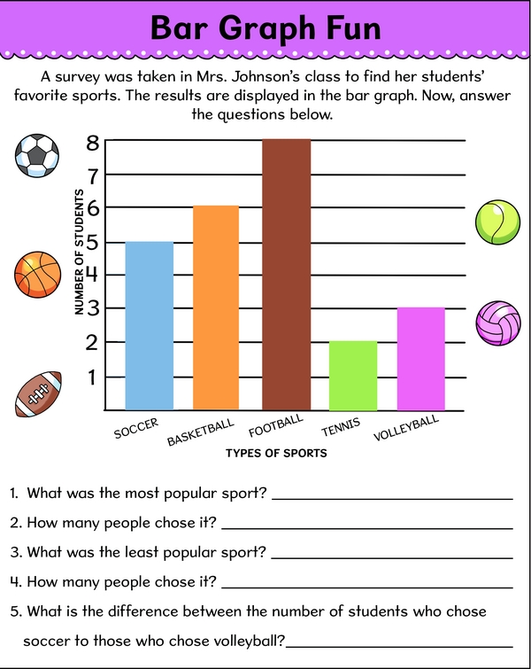
Have a lot of data and need a neat way to show the results? Let's use a bar graph! Each bar represents a group of items, and its height shows how many items are in that group. When you line up all the groups on the chart, it's easy to read the results. Now, check out this bar graph from Mrs. Johnson's class and answer the questions.
Survey Says: Bar Graph Fun - Exploring Sports Preferences
Additional Educational Resources:
Using Bar Models: Addition and Subtraction Large Workbook - (Grade 2)
Picture Graphs Large Workbook - (Grade 2)
Quick Assessment - Money Challenge (difficult): The Ultimate Coin & Dollar Challenge
Quick Assessment - Geometry Puzzles: Exploring Shape Patterns
Equivalent Fraction Number Lines
Math Sprint: Speedy Subtractions
Sweet Sums: Addition Word Problems
Learning Place Value through Descending Number Sorting
Survey Says: Bar Graph Fun - Exploring Sports Preferences
GRADES:
Additional Educational Resources:
Using Bar Models: Addition and Subtraction Large Workbook - (Grade 2)
Picture Graphs Large Workbook - (Grade 2)
Quick Assessment - Money Challenge (difficult): The Ultimate Coin & Dollar Challenge
Quick Assessment - Geometry Puzzles: Exploring Shape Patterns
Equivalent Fraction Number Lines
Math Sprint: Speedy Subtractions
Sweet Sums: Addition Word Problems
Learning Place Value through Descending Number Sorting